
As a sole proprietor, my personal or company names are often interchangeable. While I will go by almost anything you call me, I wanted to consolidate and bring to a close the last six blogs I’ve written about Business Operating Systems and how they relate to the logo I chose back in 2019.
As I wrote years ago, my company name does come from my family, selecting those critical letters to play on the word ‘jewel’.
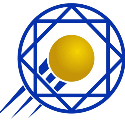
But the logo? There was a logic used for the three main components. Namely,
1) The middle gold sphere represents an end goal and a data point. It reflects my ability to help organizations accomplish great things and the ability to data mine to analyze information, identify problems and find solutions.
2) The three lines on the lower left, emanating from the sphere, indicate movement (yes, think a comet), speed, and the ability to quickly and efficiently drive and implement new projects and processes to achieve that end goal and reach that destination.
3) Lastly, the outer circle and two squares? Again, this has two aspects: they are meant to show continuous improvement, a cycle, providing an illusion as the squares rotate inside the circle, like the hands of a clock. In parallel, they also provide context (think of the axes of a graph) to provide a reference point and meaning to the sphere’s location (data).
Understanding your current position and achieving your goals with speed and accuracy. It isn’t much simpler than that in business.